|
I'm going to make the page number of the contents page number 3 because I think before the contents page I will have had a two page advert because that is quite common in magazines. As it is a magazine for 16/17 year olds, the advert would probably be for something like perfume or nail varnish etc or maybe a film that is coming out soon.
Front Cover
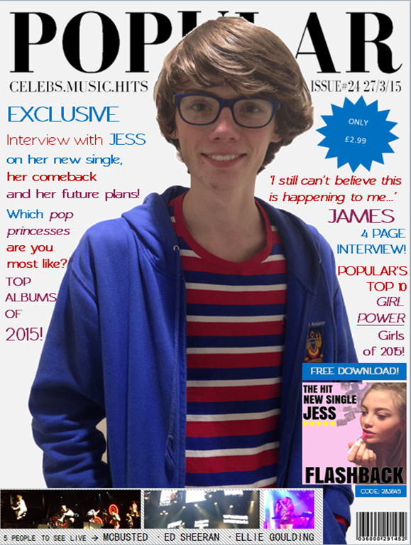
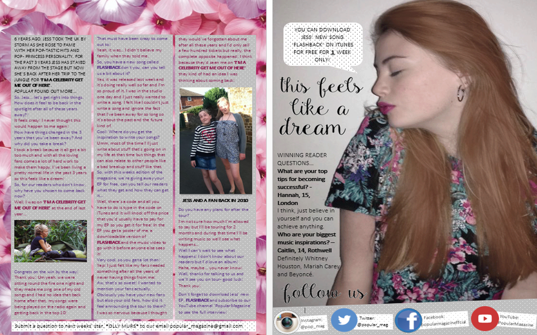
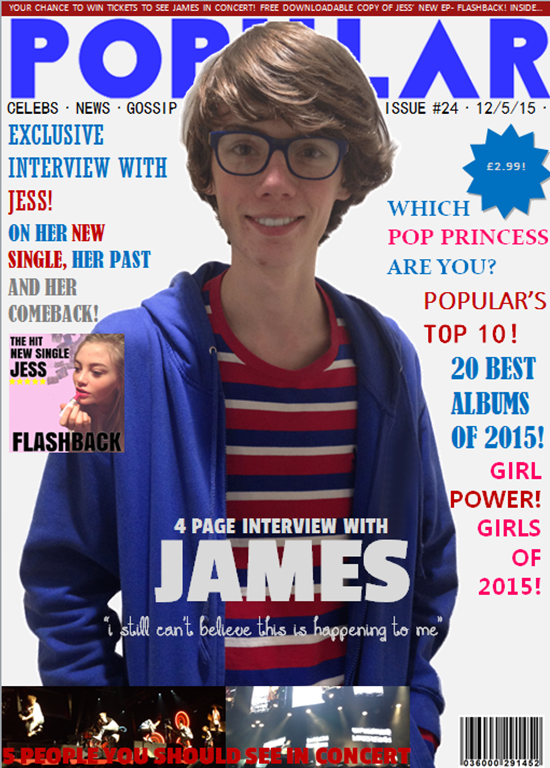
- need better colours- more shadowing - doesn't look very professional - bigger pull quote - images at the bottom look blurry - white line around James- looks poorly cropped - still plenty of space to use - more coverlines - bring picture of Jess to the bottom of the page to make it look more professional - concert pictures are slightly unclear- find better ones - add background colour - move the album to the bottom right of the page to fill space - the writing is hard to read against his jacket Contents Page - could make spacing a bit tighter - more pages - better quality images - colour scheme doesn't match the cover - text seems fairly big for and A4 sized page - include more coverlines - make the double page spread smaller to make room - make cover lines informative - remove dots Double Page Spread - bit messy - bit hard to read because of the polka dots - the polka dot pop up is difficult to read- put an actual colour on it 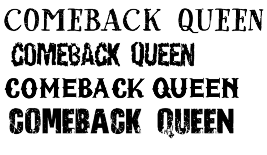 These are the possible options I have for the title on my double page spread. I think I'm going to ask the people in my class which one they think I should do. I think I prefer the top one out of the four because it looks more sophisticated and fits in more with the rest of my double page spread.
|
Archives
March 2015
Categories
All
AuthorMy name is Sophie and I'm a year 12 media student at Montsaye and this is my blog :) |

 RSS Feed
